Health Partners Quote and Join
Health Insurance gets a quick quote and join experience
Health Partners is South Australia’s largest open health fund. They’ve operated for 80 years, providing quality, value-for-money health insurance to over 80,000 individuals. They’re based in Adelaide and have metro clinics that provide superior services to their members, while also offering specialised rates for locals as well as nationwide health insurance products.
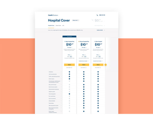
The Health Partners website has a health insurance comparison tool which is the primary sales funnel and gateway for members’ services for health partners. Nearly all new customers will use this tool to compare the health insurance products from Health Partners, making it a critical part of Health Partners’ arsenal for bringing new members on board.
Health Partners chose Evolution 7 because of our experience in building applications that could deliver a fast, smooth and intuitive user experience, one where they could track and monitor user actions and consequently deliver better value and, most importantly, increase conversions of new users over time.

A focus on simplicity and performance
Health Partners wanted a platform for their Quote & Join tool that enabled them to provide their current members and new users with a simple user experience. Simplicity was key, not only because of the amount of information that needs to be considered when choosing health insurance products, but also the importance of a prospective user’s first interaction with the provider. Health insurance is a big decision and commitment, so the Quote & Join tool had to be an easy, seamless experience that helped to build the user’s trust of, and confidence in, Health Partners.
It was also crucial for Health Partners to be able to track and analyse the behaviour of visitors on the application. This ability means that they can, in the future, implement best-practice conversion tactics to improve the effectiveness of the tool on an ongoing basis. This ultimately increases the business’s bottom line and demonstrates the effectiveness of ongoing investment in digital.
From a technical perspective, Health Partners needed a stable, secure platform for the application. Performance and conversion were the main priorities, while the application still needed to meet the stringent requirements and obligations imposed by the industry.

Sophisticated UX Strategy made for Health Insurance
To provide a sophisticated user experience, we needed to understand the client’s vision for rebuilding the Quote and Join tool and our prospective audience. To ensure this, we undertook an extensive discovery process.
We thought about the key challenges faced by users that needed to be solved; eventually, we narrowed them down to five.
Both payment security and the time taken to complete the joining process were of major importance. So, too, was transparency around price and privacy issues. Finally, it became obvious that confusion over terminology was a common stumbling block.
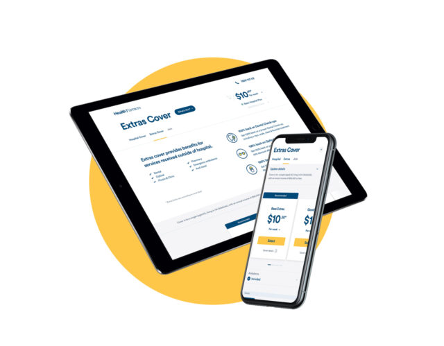
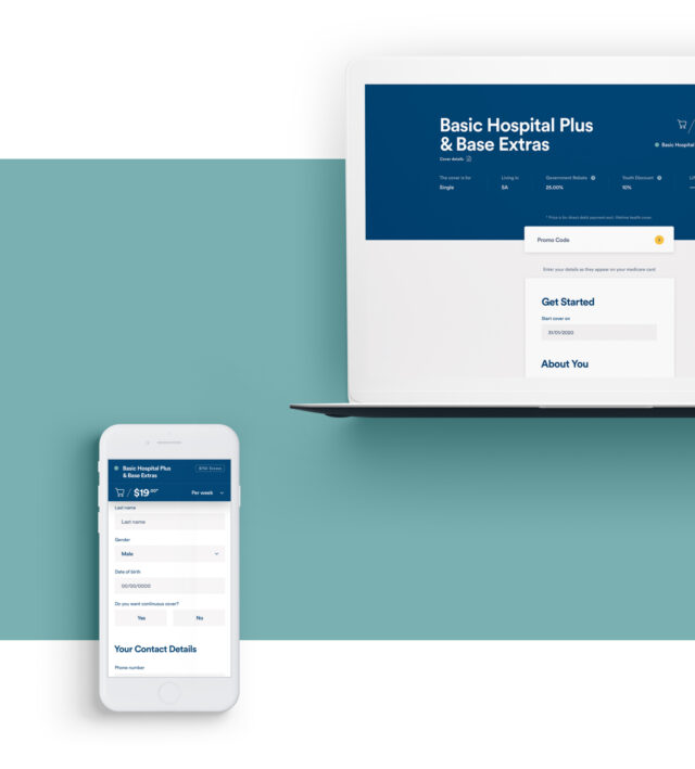
We recognised that the tool needed to be redesigned and reinvigorated. Utilising responsive web design, we ensured usability across tablet and mobile devices to improve conversion rate and broaden reach. From a technical perspective, the website needed an open source and reliable technology that supported best practice, was compliant with industry standards and covered SEO, accessibility and privacy requirements.
A scalable solution, ready for future growth
Our solution had to be scalable, ready to handle future growth and easy for Health Partners’ content team to use. They needed the ability to update and expand content and product offerings without significant front-end development work being done. The CMS had to help the team drive dynamic content across the site while easily tracking and monitoring user engagement and behaviour.
The technical priorities we recognised and addressed included an easy-to-use and flexible CMS, increased page speed and mobile responsiveness, ability to personalise content, better tracking for onsite behaviours and the ability for users to review and amend quotes.

Making Marketing decisions powered by Advanced Analytics
It was critical for Health Partners to have as much data as possible to inform them during any future marketing decisions.
To help facilitate this process, we integrated the new application with Google Analytics, Google Search Console and added custom event and goal tracking. This meant we were able to collect valuable data to understand user engagement, while the data analytics gave insights on how conversions could be improved. We also installed tracking pixels to ensure that we’re able to remarket to users depending on where they dropped out of the sales funnel. Furthermore, we can track offline conversions through Zoho CRM integrations, which also hold a lead capture gateway, providing opportunity to nurture customers through email automation.
The result of all this is Health Partners have been armed with a market-leading ability to make data-driven decisions on how to better market their health insurance products, with key insights allowing them to target users that have dropped out of the customer journey at various stages.

Validating UX Strategy and Design through Prototype Testing and User Research
As a result of our discovery process, we were able to create a full customer journey for various personas. We planned out their user stages, the key content and messaging that would be required, and looked at what type of experiences users needed at each stage of the journey to successfully move on to the next. There were also some key design principles we took from the discovery process that we were sure to stick to.
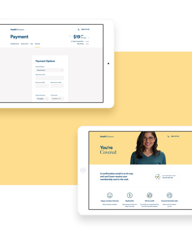
Firstly, we had to understand our users were humans and keep their needs at the forefront. There could be no distractions. We had to keep things simple so customers could focus on what’s important. Then, the joining process had to be fast, easy and secure. This meant quick, easy steps to follow and consistent on-page reassurance around secure data capture. We needed a personalised and flexible interface so customers would only see what was relevant to their own circumstances, as well as a visual guide of what they were not covered for to eliminate any misunderstanding.
To solve these challenges, we completed an extensive user-testing process by creating high fidelity functioning wireframes and a prototype of the Quote and Join tool. We asked participants to complete a series of scenarios and surveyed them on design, navigation, content placement and user experience as a whole. This led to several changes in our design, resulting in a Quote and Join experience in which users can move through the comparison stages with as little friction as possible.