Health Partners
A sophisticated, user-friendly experience to improve member loyalty and increase retention
With an 80-year operating history under their belt and a community of over 80,000 members, Health Partners is South Australia’s largest open health fund. Based in Adelaide, and with several metro clinics, Health Partners is all about providing quality, value-for-money health insurance and services to the community.
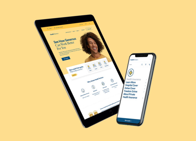
With a renewed focus on their digital member experience, we were called in to collaborate with the Health Partners team to redesign and redevelop their marketing website.
They chose Evolution 7 due to our comprehensive experience in building applications that deliver fast, smooth and intuitive user experience. Exactly what you’d want from your health insurance provider, after all.
They also knew that we could provide them with a tool that allows them to monitor and track user actions, helping drive better value and, most importantly, increase conversions of new users in the future.
So that’s exactly what we did. We re-built their marketing website from the ground up, making sure it was a fast, seamless experience suited to all members. So well suited, in fact, that it would improve member loyalty and increase retention.

A secure, easy-to-use, quick to update and comprehensive CMS
Okay, let’s get to the nuts and bolts of the brief. Our main focus for this project was to improve the overall member experience. Health Partners were less concerned with getting new leads and more concerned with optimising the experience for their current members. Maintaining customer loyalty and retention was top of the list.
Internally, Health Partners also required a digital platform that would enable their team to easily add, create, and edit content as well as track and analyse the behaviour of visitors to their marketing site. This would allow them to implement best practice conversion tactics in the future.
Lastly, one of the main concerns for Health Partners was around the security of their current CMS. In redeveloping the site, they wanted a secure, easy-to-use, quick to update and comprehensive CMS that would support two-factor authentication for internal staff members. We were happy to help.

Enabling members better access to self-serve information
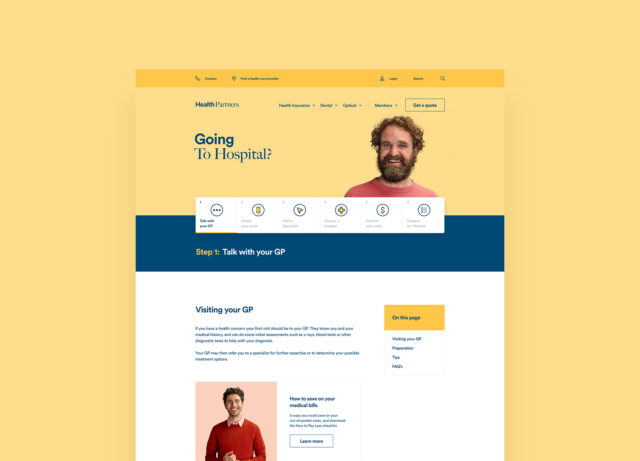
As soon as we began working, we quickly established that Health Partners were facing a number of different challenges associated with their current marketing website. So we sat down together to determine the main goals of the project. First on that list was to redevelop the current site to enable members better access to self-serve information, primarily in a task-oriented manner such as booking a dental or optical appointment online.
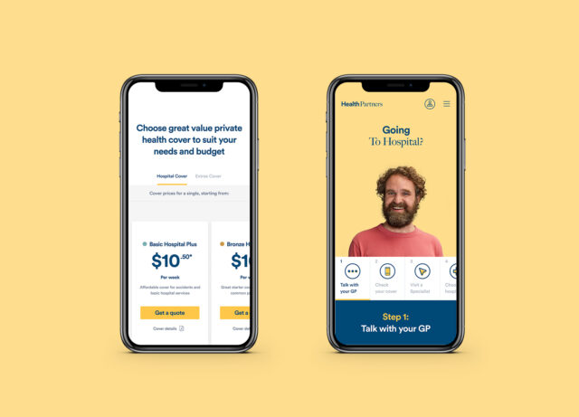
Next, we needed to ensure that the website was responsive across desktop, tablet and mobile. Not one, or the other. This included easily displayed contact information in the navigation menu and a design facelift so that existing components were consistent with their Quote and Join application.
Lastly, we needed to prioritise the ability for the Health Partners marketing team to easily add search engine optimisation directly into the CMS, by way of things like meta titles, descriptions and fallback images. In the case of Health Partners, every little bit helps and nothing was overlooked.

Improving the UX to increase member loyalty and retention
We agreed that the main focus was to optimise the Health Partners website to improve the experience for all members before any UX decisions.
Part of this involved conducting extensive research into user behaviour and needs. We did this by surveying over 100 Health Partners members; holding interviews with 40 members; analysing member behaviour on the site using Google analytics and tracking; and recording user behaviours on key pages to understand any challenges or roadblocks.
From there we delivered a roadmap of required optimisations to the website aimed to improve the overall UX and specifically increase member loyalty and retention. A major part of this was redeveloping the site to be consistent with the Quote and Join application that we had developed separately.
We kicked off the process by creating a design system within Figma. We designed each page template and components within this, allowing developers early access to CSS styling details for each component. This led to additional consistency across the site and allowed the Health Partners team to visually see how the new website would look.
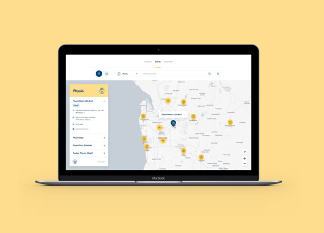
We also improved and refreshed key areas as we went, to ensure the overall site was professional, approachable and friendly. A major area that got a user interface refresh was the provider search function, which now allows potential new customers and current members the ability to navigate using Google maps to find their nearest provider and the option to use geo-location.

Our deep insight into user needs and supporting the user journey really aided us in the success of this project. Health Partners have been awarded 'Most Satisfied Health Insurance Customers' 3 years running'. We wanted to make sure that the user journey and experience reflected this, which we feel has. The outcome has resulted in a user-oriented site, in which users have easy access to information and resources regarding healthcare. We couldn't be prouder of what we've achieved across this project!